The Basics of Design
Data visualizations should be easy to interpret and look credible. To do this there are several factors that be kept in focus, called Edward Tufte's Six Design Principals of Graphical Integrity[1]:
- The representation of numbers on the graphic should be proportional to the numerical quantities measured
- Clear detailed labels should be used to defeat ambiguity. Write out explanations of the data and label important events.
- Show data variation, not design variation
- In time-series displays of money, deflated and standardized units of monetary measurement are nearly always better than nominal units.
- The number of information carrying variables should not exceed the number of observations in the data
- Graphics should not quote data out of context
These are guidelines rather than hard rules. Some argue 'chart junk' (unnecessary visual elements that do not contribute to the information presented) is not always a bad thing. Sometimes grabbing the attention of the reader is important. When critiquing a visualization address the following questions:
- What is the visualization trying to do?
- Does this visualization contain a lie factor? Or is misleading?
- How high is the data-ink ratio?
- How would you rank the visualization on a scale of 1-10?
The Design Toolkit
The three types of data are quantitative (numerical), categorical, and ordinal (ranking). There are many different ways of representing each type of data but some require more brainpower to figure out than others.
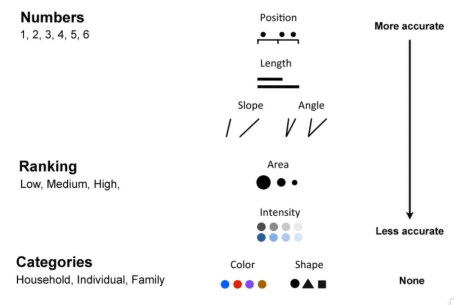
- Typical position and length are best for representing quantitative data
- For ranked data area is the best representation
- Categorical is best represented by shape or color to illustrate that each category is distinctly different.
- Never use more than 5-8 colors for categories, else-wise colors overlap
- Consider that 5% of the population is colorblind.
ColorBrewer is an excellent tools for choosing color schemes for scales.
Sketches
Sketchs are quick and easy drafts that let you test how things should look before getting into the coding. It allows us to communicate design ideas while exploring the data. Here are three general guidelines:
- Sketches should be on paper, big enough to see everything clearly
- Get the general point across, don't worry about the details
It's easy to get stuck only thinking in terms of pie charts, histograms, bar charts, and line graphs. Try new things and be creative!
Bootstrap Grid System
Structuring pages for responsive visualization is much easier using the bootstrap grid system. To set it up every element needs to be surrounded by a div container. Bootstrap sizes divs according to their class, ex. 'row' creates rows on the page.
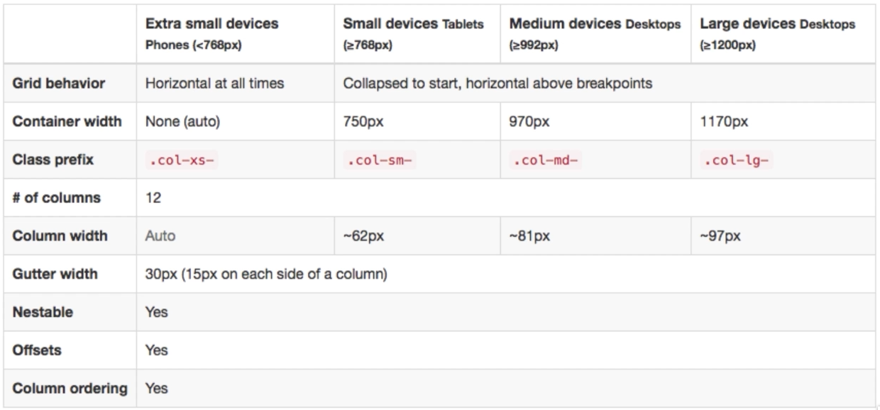
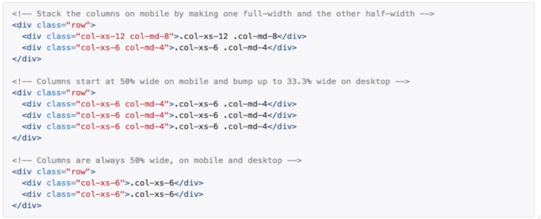
A page is always 12 columns across. Within a row we might put multiple class tags so the columns add up to different values on mobile vs desktop. Using col-xx-offset creates invisible spaces which offset columns.
[1] Edward Tufte is a Statistician and Professor at Yale University. The six design principals come from his book The Visual Display of Quantitative Information.
No Comments